
UTIG graduate research assistant Chad Greene was part of a research team from Texas to present a new paper titled “True Colors of Oceanography: Guidelines for Effective and Accurate Colormap Selection” which was published in the journal Oceanography last week. The study is aimed at getting scientists to think as seriously about color as they do about language. “The peer review process tends to scrutinize every word of a manuscript, because the subtle implications of language can lead to misinterpretation of the underlying science, however, the colors we use to convey information see very little scrutiny. If a figure is worth a thousand words, what we want scientists to start asking is, ‘are we using the right words?’ ” asks Greene.
The research group notes that there exists a double standard in research, where language which is perfectly accurate, can still be called out by a reviewer for not being scientific enough, whereas inaccuracies in figures run rampant. The scientific community tends to think of color as a mere artistic choice of no scientific consequence. “We argue that if a figure is essential to communicating the ideas in a manuscript, and if the figure contains numeric values that get represented as color, then scientists need to make sure those colors are just as accurate as the language in the rest of the manuscript,” explains Greene.
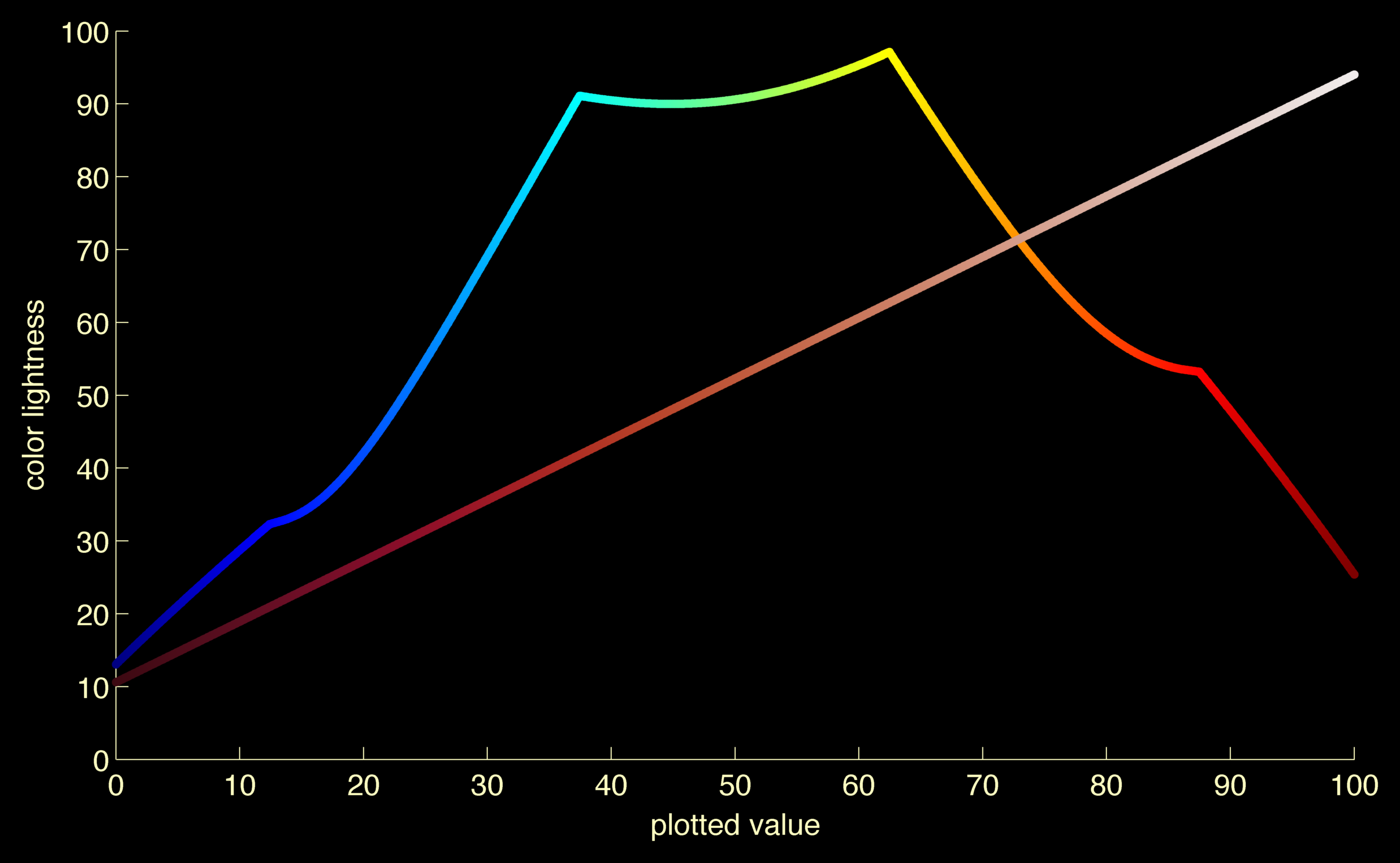
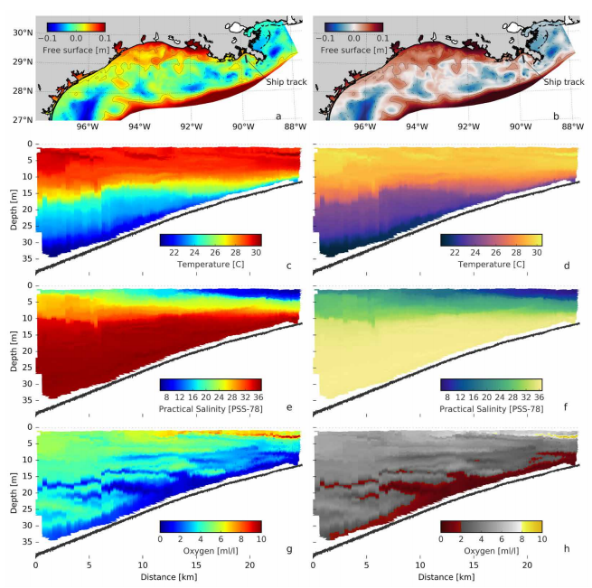
Inaccuracies exist wherever the perceived color doesn’t directly map to the data it represents. Some commonly-used colormaps, typically the rainbow-based “jet” colormap, mismatch the data mapping with how our eyes perceive the colors, leading to visual confusion. The study delves into the human perception of color to create a suite of more accurate colormaps for plotting different data. For example, linearly increasing sequential data can be represented with a simple, single-hue colormap that goes from dark to light or light to dark.
“Another drawback of the rainbow colormaps is that its lightness profile gradient is rather steep in some places, while elsewhere it’s nearly level,” says Greene. “In climate and oceanography research, gradients are important, as Earth’s climate is driven largely by gradients in ocean temperature. It is, thus, absolutely essential that the gradients we see in the figures represent gradients in the underlying data, and not gradients in the colormap.”
“We’re seeing a lot of interest in these colormaps. People are really excited about them!” says Kristen Thyng, lead author of the paper and Assistant Research Professor in Oceanography at the Texas A&M University. “We’ve made them incredibly easy to access by making them available across many software packages, including Matlab, Python, R, and GMT. People are also glad to see a paper making these points — especially in a journal that is accessible to everyone online.”
The figures in a paper may often be the first thing a reader sees, and usually the only thing that makes it to the public eye. “There is a responsibility to accurately represent the data to our community and to the public,” explains Greene. “Hopefully this paper will raise a bit of awareness about color, and give peer reviewers the extra push they may need to evaluate visual communication with the same level of scrutiny that gets applied to verbal communication.”
The full paper can be read here